Showing posts with label half rhombus mani. Show all posts

Wednesday, 2 March 2016

House Pride.


Recently I found myself in a bit of a reading rut so I went back to Harry Potter. In this case, The Prizoner of Azkaban. On top of that, a friend had recently sent me that Ravenclaw sticker and I wanted to do something in theme with it! I went for the book House colours of blue and bronze rather than the blue and grey of the films. That said, I had a hard time finding anything properly bronze in my collection. The browns didn't quite cut it, and this one literally has copper in its name. Oh well, close enough. Tape used for the design, as per usual!

Blue is Koh's '130 Midnight Blue'. The word I'd use to describe it is brilliant - it is just so stunning and sparkly in the sun. My bronze substitute is an Essence polish from the Metallics collection from 2010 (oh my god, I've had this for 6 years?!) '02 Cooper Rulez!'.
Yikes, 'rulez'. Going to erase that from my memory now.

Tuesday, 22 September 2015

Belle Émeraude

A mani from a while ago, right after an unfortunate break, argh.
The green used is Max Factor's '16 Emerald' and the gold is from YSL's limited edition duo 'Belle de Nuit'. What I like about this gold, as opposed to the other one in my collection is that this is more of a 'true' gold, a yellow rather than a pink-leaning. Especially in this colour combination, the yellow gold works much better to elevate both colours to an interesting whole.

Monday, 22 December 2014

Pastels.

't Is the season for themes I don't seem to be ascribing to. I had meant to, really, but the super sweet pastel polishes I got from my aunt were calling out to me to try them first.
I'm afraid I don't know what this particular polish is called, as its sticker is missing. A better reflection of the colour is visible in this post (I couldn't tell when I took the picture, and by the time I uploaded it from my camera it was too late.) The formula was actually pretty disappointing and it didn't cover well at all. Hurts especially for such a cute colour.
I imagine it comes as no surprise that this is the colour and nail art combination I went for. I can tell you the name of the purple however - Rabat 149. For a better idea of the real life colours I refer you back to the other post again.

Sunday, 23 November 2014

NYC - Strip Me Off review


Some simple nail art, because what I wanted to try out was NYC's 'Strip Me Off', a peel-off top coat.
Since OPI's version of the product I've definitely been interested - doesn't everyone hate the clean up of glitter nail polish? - but OPI is pretty pricey in The Netherlands so I've held off. A little while ago, a friend told me NYC now had essentially the same product and it just so happened the Kruidvat had some 2-for-four-euros sale going on. I unashamedly love a bargain.
The glitter polish used is W7's '125 Twilight', and the whites are a Hema white numbered 809 and Safari's No56 (which I'm fond of, but tends to goop a little too much for comfort but I'm afraid to dilute it with thinner.)

I wore this nail polish with Strip Me Off for about three days. What I noticed was that tip-wear started to occur sooner than it usually did. However, this mani went to work with me twice - that's two evenings of cleaning, so it's basically all hands - and it survived that very neatly.

I can summarize the removal experience in basically a single sentence - "works as advertised". It takes a little doing, but it's definitely less of a messy process than normal. After the biggest parts were peeled off I needed a drop of nail polish remover to get rid of some stray flecks here and there, but all in all it was less work.


'Strip Me Off' is (regardless of the oddly suggestive name) a very decent alternative to 'Glitter Off', and given the lower price but not significantly lesser quality, is the one I'd recommend!

Sunday, 1 June 2014

You Belong to Rambo No. 5

And with this - another version of my beloved half rhombus - I complete the Catrice section of my Stash page. Post title is a mash-up of the two polishes used. The green is Catrice's '670 It's Rambo No. 5' and the mint blue is an Essence colour & go by the creepy name of '53 You Belong to Me'. No, nail polish, as a matter of fact, you belong to me. The 'colour & go' polishes were such a hit and miss in terms of quality that I almost never bought them for myself, but since they were very affordable I was often given them as little presents. This one falls under 'miss', which is a shame because I like the shade, but its coverage is terrible and the formula is very disappointing, very streaky. It is however fine for this type of thing.
Added a little rhinestone because I don't often do, and made the rest matte because I think it's suits the army green of Rambo.

>> Click for tutorial <<

Friday, 18 April 2014

Black & Blue.

Another half-rhombus. By now a cliché trademark choice.
I needed a new black since my older ones are getting droopy and no longer as easy to restore with a drop or two of nail polish thinner. Wanted to combine a light colour and that black in something easy.

Catrice, '39 Black to the Routes' & Rimmel, '198 Azure'.

Saturday, 23 November 2013

Osaka.


Before I begin...

DOCTOR WHO COMES BACK TODAY!

Happy 50th, Doctor Who!

Now on to the regular nail stuff.
I thought it a shame to get rid of Kingston so quickly, so I did a simple tape mani on it using Herôme W.I.C's 'Osaka 91'. A slight variation on my much abused half rhombus, as you see. The nails with gaps on top sadly didn't go as smoothly as I would have liked, though.

Osaka is a red that's bright and quite in-your-face. Such bright reds sometimes lean towards the orange, but this one is proper fire-engine red.

Monday, 4 November 2013

Happy (belated) Halloween!

Themed cupcakes, courtesy of my wonderful mother!
Even though we don't celebrate Halloween as elaborately in the Netherlands as they do in the States, it's still my favourite holiday, and as the years progress more and more Halloween-themed parties are thrown, more trick-or-treaters venture out into the night and more spooky decorations and products find themselves into the stores! I can only wholeheartedly applaud these efforts!

Sadly, October is a busy time for me, and I always seem to fall short for time when it comes to doing nail art of that one day a year I love so much. So here, is my unfortunately rather bland Halloween nail art.
It was originally my intention to paint a little ghost on both ring fingers, but a large assignment and having to prepare for tests prevented me doing so. School before nails, after all. 

Orange is Herôme's 'Zagora 150', gray is my trusty NYC '003 Prey of Grey'

Tuesday, 18 June 2013

Eat the Rude.

I'm sure most have now heard about and possibly seen NBC's new 'Hannibal' show. The first season's nearly over, and I have to admit I wasn't hooked from the get go. A few episodes ago, though, it seems like something clicked with me and now I'm sad I'll have to wait for the next season for so long.
I tend to follow up my fancies with nail art, so Hannibal is no different.


I stopped layering this red (Rimmel - 035 Wine Not) so it wouldn't be a completely opaque shade. The effect won't come across in the picture, but I like the subtle changes it makes in the shade when the light hits it differently, making it reminiscent of liquid. (Blood or wine is anyone's guess.) Bottom polish is YSL 141, which is probably my favourite silver. And obviously it's another half rhombus mani because it suits the theme and not because I am just obsessed with them. Obviously.

And now the more clearly Hannibal part of the nails -
Swiggity swag, I'm a stag.
Black is the Koh polish of the same name, and the antlers are acrylic paint.

Sunday, 12 May 2013

Lilac Fever.


 My previous mani left me wanting to experiment some more with sponging and gradient techniques. How could I not try to combine it with my other favourite style of nail art? 'Half rhombus' style counting 6 now.
I thought it'd be nice to try this with shades of purple but.. I don't know, it gives off a bit of a '14-year-old-girl' vibe in my opinion. I think the lilac shade is to blame. Oh well. I quite like the result of the experiment anyway - pretty much what I had in mind! And slapped on some rhinestones because I just have too many of those.

  
Essence, Crazy About Colour, '02 Lilac Forever
&
Herôme W.I.C. 'Dakar 107'


Friday, 26 April 2013

Outta This World.


My birthday was earlier this month, and a friend of mine got me some polishes! (All Rimmel; 035 Wine Not, 198 Azure, 519 Desert Beauty, 600 Deliciously Dark & 700 Block Your Green)

I've already worn Wine Not and Deliciously Dark in a pretty nice layering experiment which I sadly (due to lack of camera) didn't get to photograph but which I may have to repeat in the future because it created a lovely dark burgundy sort of shade.

For today's mani - which is another half rhombus - I used Azure.

 The tape came off very smoothly so I got excellently crisp lines in this one! The silver under Azure is YSL shade 141 - White Gold.

Post title brought to you by this little alien guy.

Wednesday, 24 April 2013

The Culprit.

An oldie, but a goodie. Originally done late August 2011, this style of mani (which I've come to refer to as half rhombus) has easily become one of my absolute favourite and go-to kinds (hence I call this post 'the culprit' - this mani is to blame for my frequent use). They're relatively easy to do and don't comparatively take as long as more elaborate styles of nail art, but when you choose the right colour combination they'll make no less of an impact. People tend to compliment these whenever I do 'em!

Used here are Koh 'Metallic Green' for the lower layer (though through use of top coat the 'holo' effect was reduced as they sadly do) the pinkish/purple is Essence's 'Do a Floating Pirouette' from the Ballerina Backstage LE.

Sunday, 19 August 2012

Another one of those.

This is my 50th post! Woohoo!

I say 'Another one of those' because this is another what I refer to as a half rhombus mani (also called a v-gap and several other things but I think half rhombus sounds about 20% cooler.). I really love them. This is the fourth I've done, I think. On we go!


It's Dior '903 - Black Ink', which is a dark blue that in most light - as implied - looks basically black.
Not the world's neatest mani, but I'm content with it. Only one layer of Black Ink over a lighter polish, so it doesn't look totally black. After years of wearing mostly black nail polish, I now rarely do.


Would you look at that stunning blue shimmer? It looks MARVELOUS out in the sun, it really does.
Deep, dark polishes really look their best in the brightest sun, don't you think? A little ironic perhaps, but I'll roll with it.

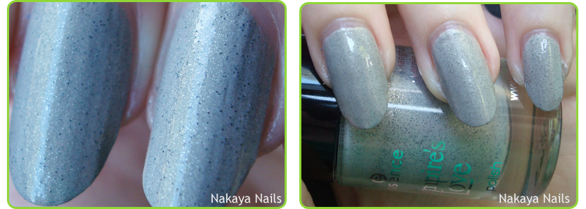
The polish underneath, however, I'm not so happy about. It's '04 - The Dawn is Broken' from Essence's Vampire's Love LE. I had an unfair prejudice against this polish to begin with because I don't care for Twilight in the slightest, and the dislike turned somewhat justified when it turned out I don't like this polish. At all.
Yuck. It looks gritty and it reminds me of cement. I sort of like the general idea of the polish, but it just doesn't look right. Largely hidden under the Dior polish I don't mind it so much, though. Still think I won't be using it again any time soon.


Monday, 30 April 2012

I'm with Genius.

When Catrice brought their new polishes on the market, I mostly looked forward to 'Genius in the Bottle'. I don't know whether it's the name or the polish itself or some combined factor, but there you have it. I bought it some time ago but hadn't worn it yet. I've since read some reviews and a lot of people seemed to be.. well, I won't say 'disappointed', but definitely a little let down. So I thought I'd try it with some nail art!

Older half rhombus manis to be found: here and here.
I'm really quite fond of this style of nail art. I've done it several times before and never quite had a good name for it, until a friend dubbed it a "half rhombus mani". I stuck with that. This half rhombus is, of course, Catrice '840 - Genius in the Bottle', and a metallic black YSL polish. Ah, the marvelous magic of tape-manis.
Enjoy my tacky vintage effect?

I really don't have very many complaints about this polish. I'll grant you that the duochrome effect seems a lot more impressive in the bottle, and I think that's where most people's disappointment will have come from. Well.. it is genius in the bottle, they don't guarantee it'll still be there when you take it out ;)...
The sheerness is also completely taken care of if you layer it like this, and the dark contrast really makes the gold and green stand out nicely.

I know I'll certainly be wearing this polish again, probably in combination with another style of nail art. I think it simply works best that way.

Titular reference and t-shirt, by the way, stem from Stargate Atlantis' resident genius and personal favourite character of mine, Rodney McKay.