Thursday, 30 March 2017

Trind Duo.

Left: TrindCC144, right: Trind - CC142
Solid set of metallic nail polishes.

Wednesday, 15 March 2017

Chanel - 639 Exception

Chanel - 639 Exception
Though my mixed relationships with red is never far away, this one's an absolute keeper (dare I say.. an exception?). Very 90's with its deepness and brownish tones.

Sunday, 12 March 2017

Friday, 10 March 2017

Complementary.

Purple: Trind - CC149Green unknown, brand rubbed off the bottle.

Thursday, 23 February 2017

Matte Gradient.

Gradient: Catrice - 240 Sold Out Forever & 740 King of Greens,
Matte topcoat (shown) Chanel - Le Top Coat Velvet

Sunday, 5 February 2017

Vert D'Orient

I am in looooooove. All other tealy greens can pack up and go home. This is the unchallenged victor. What a beaut, what a stunner! And not only is it positively gorgeous, the formula is exactly what it should be. The brush is a good width, applies like a dream, perfect coverage in two coats.
I usually tend to be pretty satisfied with Yves Saint Laurent polishes, but this one is everything I could ask for in colour and application. This.. this is all I have to say, I'm afraid! I'm just beyond satisfied with it.

Chanel - Le Top Coat Lamé Rouge Noir


Saturday, 4 February 2017

Sunday, 13 March 2016

Terrana & Paradisio.

My Chanel polishes had previously only been used for some detail work, so I thought it was about time I wore them on their own, too.

'Is that a Christmas tree? When did you wear this exactly?' Shhhh, you.
Terrana is a nice earthy brown, and I really like this shade. It's quite unlike any other brown I own. It has a subtle, non-overwhelming shimmer and applies just fine.

Of course, the green is my favourite of the two. It has a bit of a mother-of-pearl-y consistency which makes it a little on the sheer side, but it has such a strong shine to it that you don't really see the nail through it all that much, and subsequently it didn't bother me. Hurray! I used two coats.

Wednesday, 2 March 2016

House Pride.


Recently I found myself in a bit of a reading rut so I went back to Harry Potter. In this case, The Prizoner of Azkaban. On top of that, a friend had recently sent me that Ravenclaw sticker and I wanted to do something in theme with it! I went for the book House colours of blue and bronze rather than the blue and grey of the films. That said, I had a hard time finding anything properly bronze in my collection. The browns didn't quite cut it, and this one literally has copper in its name. Oh well, close enough. Tape used for the design, as per usual!

Blue is Koh's '130 Midnight Blue'. The word I'd use to describe it is brilliant - it is just so stunning and sparkly in the sun. My bronze substitute is an Essence polish from the Metallics collection from 2010 (oh my god, I've had this for 6 years?!) '02 Cooper Rulez!'.
Yikes, 'rulez'. Going to erase that from my memory now.

Saturday, 27 February 2016

Melange.

Left: 100 Top coat
Right: 560 Spice Age
I'd like to think I have a healthy skepticism towards things that seem gimmicky. Often enough, they don't deliver on their promises.

I had similar hesitations about Sally Hansen's 'Miracle Gel', no-lamp-needed shtick. (I think the word 'Miracle' sets off my cynicism, to be honest.)

I was actually really satisfied with the results!


The post title is a reference to Frank Herbert's 'Dune' because of the nailpolish name. Spice. Geddit.
I had a hard time getting a clear picture, and this one doesn't show the nice shimmer as well so you'll just have to take my word for it. For not-wanting-to-start-over's sake, I let each coat dry for a considerable amount of time out of fear for ruining the curing process somehow. It took a little time, but it was hard as the proverbial rock and didn't chip or scratch the entire time I wore it. When I took it off a couple days later, it still looked freshly done, so colour me impressed on this one!

Thursday, 31 December 2015

Shimmery Send-off.

(If you don't know, these are 'oliebollen', a traditional Dutch new year's snack thing.)
Here we are, arrived on the last day of the year, and the sun briefly came out to play to allow me to take pictures of what will be the last nail polish I wear in 2015. Thank you kindly, sun.
On that note, my blog-related new year's resolution is to write less about the darn weather. Will I be able to? We will see.

Anywho, I don't particularly enjoy New Year's Eve festivities but for the hell of it still chose a polish with a bit of sparkle to it, to end things on a fun note.

This Miss Sporty polish, only given the number '420' (insert 'blaze it' joke of choice here) is a nice cool grey, livened up with multicoloured shimmer.

Everyone have a wonderful 2016 ♥

Sunday, 20 December 2015

Green Marble.

It is my goal to stubbornly keep attempting the occasional water marble nail art until one day I might actually be able to pull them off with only a minimum of frustration! Still going for the darker, autumny colours, though my fellow nail bloggers make me feel like I should be on the Christmas train at this point.

Colours used are Dior, '605 Amazonia' and Catrice '670 It's Rambo No. 5'. The latter of which I've since given to my sister because in the many years I've owned it it has been used.. maybe twice.

Monday, 14 December 2015

Elderberry (not so) Matte

Though it might be the season to be jolly, it is absolutely not so for nail photography. At best, natural light is bleak and grey, at worst, there's none whatsoever when the clouds are dark and the rain is pouring. But before I start waxing poetic even further, I'll get to the nail polish, shall I?

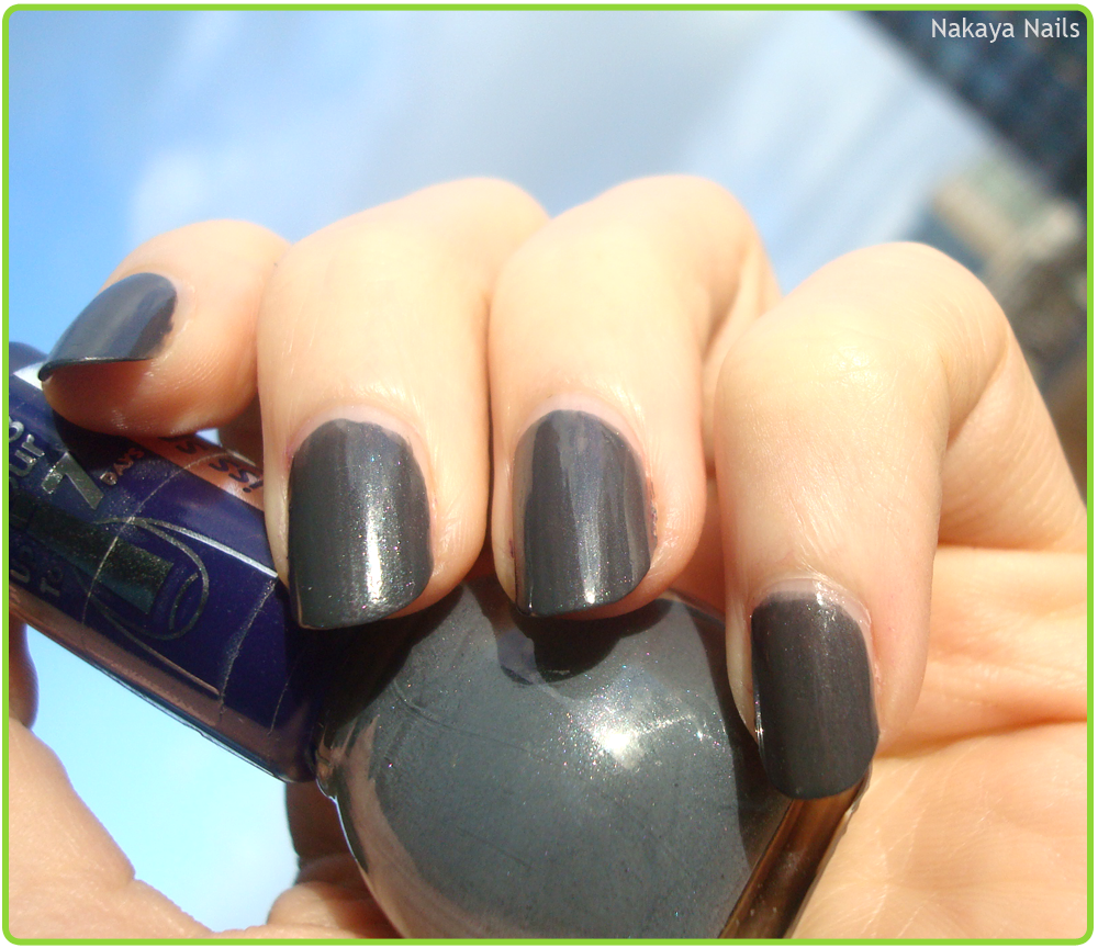
It's a Pieces polish by the name of 'Elderberry Matte', and though I suppose the Elderberry part is all well and good, I don't feel like the finish of this one is all that matte. (Say that five times fast!) Since it's not that matte and unfortunately a little on the streaky side, it definitely needed a topcoat to try and even it out a bit.
Alas, as lighting conditions were not working out in my favour, the photo with top coat turned out somewhat on the grainy side. Streakiness aside, the colour both applied and lasted well.

Saturday, 5 December 2015

Frankfurt.

Now that I'm wearing it, I can't believe I let this stunning blue be an untried for so long. It has such a deep richness and vibrancy to it, somehow. It's Herôme W.I.C.'s 'Frankfurt 120'. I can fairly safely say it has instantly become my favourite dark blue.

Still, lovely as it is on its own I wanted to add a little something extra. This little design is from Konad plate m15 and the colour is actually a nail art striper by Max called 'Grey Galaxy'. As you can probably see by the slightly awkward placement, I'm out of practice with stamping. This was the second attempt. Yikes.

Tuesday, 1 December 2015

1.2.3.

A simple, thick striped tape mani. This one was inspired by another piece of clothing somebody on television wore, but no matter how much I try to rack my brain I cannot remember what it was. The unknown gentleman on screen was wearing a cardigan striped grey, light blue and dark blue. I wanted to give it a little twist and make it less visually grim by going with an off-pink shade instead.

Colours used; Catrice, 'C05 - Nautica', Koh, unknown colour, Koh, 'No Worries (217)'.

Monday, 23 November 2015

Autumn.

Of all the seasons, autumn is the one with the best PR. With pictures of leaves in beautiful colours, cozy sweaters and pumpkin spice lattes, it's enough to make you actually look forward to it.
And then it arrives.. and it's rain, wind and cold all day, every day. No thank you!

That said, I still felt like doing some nails suited to the season. In retrospect, I think I should have used either a darker brown or a lighter shade of red to have it look best, but I'm still satisfied with the result the way it was.

Polishes used are the following -
Dior, '413 Grège'
Dior, '943 Rouge Garconne'
Chanel, '697 Terrana'
Herome WIC, 'Utreg 173'
Herome WIC, 'Zagora 150'
P.S., white.


Sunday, 15 November 2015

Dutchess.

The tape strips I had cut off for a previous nail art were way too long and thus unwieldy and I had cut them in half. Leaving me with a bunch of tape.

I had two recently acquired polishes - a silver Depend polish numbered 'Nr. 206' that my aunt bought me in Spain, and a Wet 'n Wild polish from the Fergie collection called 'Dutchess' that I picked up at the local tourist market.

It didn't take a genius to figure that Dutchess is more of an effect polish and wouldn't work for me on its own.

And so we have arrived at this nail art.


The Depend polish is a nice, metallic silver and I'm glad to have it in my collection as I use that sort of thing especially as a nail art base all the time.

I'm not too big on Dutchess - in my opinion it looks nicer in the bottle than it does on the nail.
I liked the look of the purple glitters (again, in the bottle) but they don't really stand out in the shades of blue, which is a shame.

Saturday, 7 November 2015

Bright.

Here again is the Depend polish brought to me from Spain.
The moment I got it I really liked the image in the packaging, it's fun and vibrant and reminds me of paisley print.
And I do love me some paisley print. It's probably a good thing I don't run a fashion blog.

The polish itself isn't relevant to this post, but I wanted to try and recreate something similar to the background picture as an accent nail, so I did!

Base colours: white is a nameless polish from Primark's P.S. brand, minty green is OPI's 'That's Hula-rious'.

Detail colours: Herôme W.I.C.'s 'Dakar 107', Koh's 'Coral (185)', 'No Worries (217)' and an unknown polish from the same brand.

Tuesday, 3 November 2015

P.S., That's Hula-rious!

Here we've got a white polish from Primark's P.S. brand, I couldn't find a discernible name on the bottle anywhere and OPI'S 'That's Hula-rious!', a super cute mint shade.
What's interesting to me here is that Primark's polish, a budget one at its mere €1.50 and the OPI, retailing in the Netherlands around €14.95, have very similar issues.

My search for a good (and affordable) white nail polish is never ending and I'll be blunt in saying that the brush on this one is absolutely shit. It's a flat brush which I initially thought a positive, but the bristles are all over the place and make it hard to apply an even coat without scratching the one beneath it. It needed three frustrating coats to cover to a point where I was content with it. Despite that, I do really like the formula on this one. It's the only white in my collection so far that actually looks more like nail polish than white out. Decidedly a good thing, that. Until I find something with both a decent formula and a decent brush, I'm still going to consider this one a win.

The brush on 'That's Hu-larious!' has misbehaving bristles as well and similarly makes it a challenge to get a nice opaque coverage going. In its defense I will say that this particular shade of minty green is 100% my favourite of all minty polishes I've encountered so far. It's just so sweet and bright and fresh that I'll keep using it despite the non-ideal brush situation.