Monday, 30 April 2012

I'm with Genius.

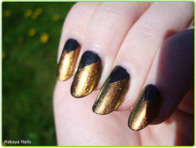
When Catrice brought their new polishes on the market, I mostly looked forward to 'Genius in the Bottle'. I don't know whether it's the name or the polish itself or some combined factor, but there you have it. I bought it some time ago but hadn't worn it yet. I've since read some reviews and a lot of people seemed to be.. well, I won't say 'disappointed', but definitely a little let down. So I thought I'd try it with some nail art!

Older half rhombus manis to be found: here and here.
I'm really quite fond of this style of nail art. I've done it several times before and never quite had a good name for it, until a friend dubbed it a "half rhombus mani". I stuck with that. This half rhombus is, of course, Catrice '840 - Genius in the Bottle', and a metallic black YSL polish. Ah, the marvelous magic of tape-manis.
Enjoy my tacky vintage effect?

I really don't have very many complaints about this polish. I'll grant you that the duochrome effect seems a lot more impressive in the bottle, and I think that's where most people's disappointment will have come from. Well.. it is genius in the bottle, they don't guarantee it'll still be there when you take it out ;)...
The sheerness is also completely taken care of if you layer it like this, and the dark contrast really makes the gold and green stand out nicely.

I know I'll certainly be wearing this polish again, probably in combination with another style of nail art. I think it simply works best that way.

Titular reference and t-shirt, by the way, stem from Stargate Atlantis' resident genius and personal favourite character of mine, Rodney McKay.


Monday, 23 April 2012

Your faithful student..

Twilight Sparkle!
Sometimes I think my blog is just blue, green and purple polishes.. anyway.
My own personal Pinkie Pie One of my friends has not too long ago converted me to pony-dom, so logically nail art had to follow. And of who other than my favourite pony's cutie mark, of course. 

This is another one of H&M's 'Say No To Racism' set, by the name of 'Pale Violet'. I have previously reviewed & swatched Pear Icecream from the same set. Like the former, I'm not exactly impressed with the quality of this polish either. At 3 coats, it still doesn't cover as well as it should, but I have less complaints than with Pear Icecream. The pink is my remarkably-frequently-used-for-a-colour-I-don't-like 151, L'Oreal Resist & Shine Titanium, and the white is a Hema French manicure striper.


Saturday, 21 April 2012

Ch-ch-ch-changes!

Tuuurn and face the strange, ch-ch-change-- sorry. On with the post. 

One coat my ass.
To get on with trying my untrieds, I had to do some layering. The above is Rimmel 825 Sky High which, aside from being rather unfairly marketed as a 'one coat polish', is really a very nice colour and is just fine as long as you put on at least two. Which I did do after taking the above pictures. It's also not untried, I've worn it before.

The actually untried polish I wanted to try here was the Blaze polish that changes colour in sunlight. I've used polishes of the brand before, so I knew wearing just that would do a very poor job of covering my nail in less than 20 layers. Hence the layering with Sky High. Anywho, my Blaze bottle lacks stickering of any kind that could tell me the name, but a search on the product website leads me to think it's Tahitian Skies to Purple Rain. Bit of a mouthful. Personally, I think it leans more to a pink than a purple in the bottle.
I quite like the effect obtained from layering it over Sky High, gives it a bit of a mother of pearl look.


Before and after exposure to sunlight. Do forgive the lack of clean up, I ran outside to catch a bit of the sun before it'd disappear for the day!


Wednesday, 18 April 2012

Identity Crisis.

This, is a beautiful colour. Before I put it on I remembered it as being a lot more green than it actually was, and in the (lack of) light in my bedroom it also seemed.. less blue. But once outside - blam! It suddenly struck me as being, rather than green, so very teal.
Doesn't it look like it could've been the kid of these two polishes?


There is a fair amount of shimmer going on in this Miss Sporty (Clubbing Colours) polish.
It covered very nicely in two coats and there had been pretty much no sign of tip-wear when I took it off the week after, so that's always a plus.
Artificial light - flash.

Sunday, 15 April 2012

Barely Matte.

I wanted to make the title of this post a race-related pun around the word 'matte', but I'm coming up empty. Why race-related? Because this Herôme W.I.C polish is Dakar! Obvious associations with the off-road race.
It's covered (and I use the term generously) by Hema's matte top coat. Which I am incredibly dissatisfied with. That's not matte! It's 'moderately less shiny-fied' at best! 
It also seems to wash off. Is that a regular thing with matte top coats? Either way, I intend to search for a better matte, because I've been unhappy with this one for quite some time now.
As for the purple, it's a good polish. Covers in two and is opaque. No shimmers in sight for this one. It's not very special but if you find yourself lacking a good 'base' purple in your collection, this one is well worth considering.
Artificial light - flash.

Please don't hesitate to recommend a good matte top coat ♥~

Monday, 9 April 2012

"Bagels and coffee!"

If the titular reference is unfamiliar to you, I'm going to guess you haven't seen Paul. Or.. maybe you have, but don't remember the line because you're not one of those people that feels they should commit all quotes to memory. But I digress.
April 6th was my 20th birthday, and on the day after a bunch of my friends came over. One friend and her boyfriend presented me with the two lovely Teeez polishes I've used here. I'd never used Teeez before, but it's certainly something I intend to do more in the future. The base colour 'Free 06' applied very nicely in two coats. The bright alieny green 'Big Apple' was lightly sponged on the tips.
Flash - bottles.
Unfortunately, it's currently raining, so these are all indoors pictures. Since they're taken so closely to the window, though, I think you get the general idea.
The sponging is subtle but it's such a nice sparkly green it's still noticeable.