Showing posts with label Catrice. Show all posts

Thursday, 23 February 2017

Matte Gradient.

Gradient: Catrice - 240 Sold Out Forever & 740 King of Greens,
Matte topcoat (shown) Chanel - Le Top Coat Velvet

Sunday, 20 December 2015

Green Marble.

It is my goal to stubbornly keep attempting the occasional water marble nail art until one day I might actually be able to pull them off with only a minimum of frustration! Still going for the darker, autumny colours, though my fellow nail bloggers make me feel like I should be on the Christmas train at this point.

Colours used are Dior, '605 Amazonia' and Catrice '670 It's Rambo No. 5'. The latter of which I've since given to my sister because in the many years I've owned it it has been used.. maybe twice.

Tuesday, 1 December 2015

1.2.3.

A simple, thick striped tape mani. This one was inspired by another piece of clothing somebody on television wore, but no matter how much I try to rack my brain I cannot remember what it was. The unknown gentleman on screen was wearing a cardigan striped grey, light blue and dark blue. I wanted to give it a little twist and make it less visually grim by going with an off-pink shade instead.

Colours used; Catrice, 'C05 - Nautica', Koh, unknown colour, Koh, 'No Worries (217)'.

Monday, 26 October 2015

Outta My Skull.

More Halloweeny nails! I love doing them and I love seeing the influx of them all over the place.

A friend of mine had posted a picture of this H&M nail sticker set and I told her I loved them - and she sent them to me! An absolute darling. I can only say I'm very grateful because I love the collection of images present here.

I have skulls standing around all year.
Halloween or no Halloween.
Though it was the little alien heads that caught my attention initially, for this manicure I wanted to utilise the little skulls.

The stickers all seemed a little large to me initially but once applied it wasn't an issue.


When removing the sticker from the set I was a little surprised to find it was transparent instead of the white I was expecting, but by then I'd already coated the nail in Herôme W.I.C's 'Zagora 150'. I went ahead and applied it anyway and I can't say it looks any worse for it.
As for the rest of the nails, I wanted to complement the orange with a heavy black-white contrast. I'd considered using tape to separate the black from the white but it would have been far too clean for this look.  I wanted something grungy, and roughly sponged Catrice's '39 Black to the Routes' over 'P.S.' white so the distinction would be clear without becoming a smooth gradient.

Wednesday, 21 October 2015

Franken-French.


Today, on October 21, 2015, the day when Doc and Marty traveled to the future I bring you some Halloweeny nail art. I present to you the Franken-French. (And don't get started on how that should be 'Monster-of-Franken-French'.)

I wanted to keep it as subtle as is possible when you've got fake stitches running along the tips of your nails with a subdued kind of green, if you will. Chanel's '645 Paradisio' has recently entered my collection so it seemed like a good choice (and let's be honest here, I just wanted to use it, I can't resist a shiny new green).
As base to lighten the nail I used Koh's 'Orchid', and the stripes were done with Catrice's '39 Black to the Routes'. What this nail art irrefutably showed me was that I really need a new nail art brush. During this I kept alternating between the two I've got, and neither of them actually do what I need of them to.

Saturday, 17 October 2015

The owls are not what they seem.

 Who's excited about the return of Twin Peaks? Meeee!

I've been wanting to do some Black Lodge inspired nail art for a while, but it kept on not happening somehow. 
Then I ordered some chevron-guide stickers and.. they were way too big for what I wanted to do, so that didn't pan out.

Then I got a pair of those scissors that cut zig-zag patterns, which is how I accomplished this. The scissors kept misbehaving though, so I'm not sure if I'll see a return of the chevron on my nails again soon. 

Damn fine cup of coffee.
The base whites are Safari's 'No56' and a Hema polish, neither of which I particularly recommend. The black, Catrice's '39 Black to the Routes'. The red nail, based on the scenery of the waiting room, is actually several shades of red stripes layered over each other to get that curtainy effect, though it's not too clear in the pictures. They are YSL, 'No04', Max Factor '549 Red Passion', Rimmel '035 Wine Not' and Koh's 'Red!'.

Saturday, 2 May 2015

Deco.

In a previous post, I mentioned that I had become inspired by some art deco patterns I'd seen, and added a picture of a failed attempt at doing some nail art along those (proverbial but I guess also literal) lines.
Though the execution didn't quite go as intended at the time, the inspiration itself still tugged at me and I was up for trying something else. Gold on its own isn't really my thing, but use it sparingly and as an effect colour next to black and I'm happy to wear it.

Art deco is of course marked by its symmetry and its geometry, and it is easy to miss the mark when you utilise a technique like water marbling which doesn't always grant you that much control, but I think I did alright in retaining the general vibe of the style here.
Polish used are Dior's '668 City of Gold' and Catrice's '39 Black to the Routes'.

Tuesday, 17 March 2015

Luck of the Irish.

Today is St Patrick's Day, so green nails with little accent glitters it is!
I don't need a reason to deck myself out in green, but I'll take it when it comes along! I'm also not remotely Irish, but I figure I can get away with it as a redhead.

As an amusing coincidence, I was given a little pastry at my grandfather's birthday the other day almost this exact shade of green. Meant to be. Should've taken a picture, but alas, I didn't think to do so until I'd dug in already.

This pale green with its light emerald shimmer is Catrice's own '240 Sold Out Forever' from.. quite a few collections ago. It still has the thin brush. A cute colour, but definitely one needing three coats to cover decently.


Sunday, 1 March 2015

Rest in Peace, Leonard Nimoy.

I took a break from nail art, which unintentionally turned into a break from posting as a whole. Real life situations, and relying only on a temperamental laptop kept me away. I've built up a small backlog of photos I'll be posting in the future, but for now I want to post some new nail art.

On Friday the 27th, Leonard Nimoy passed away at the age of 83.
I'm a long-time Star Trek fan, and though he had lived a long and full life, it's still upsetting to see a hero go.


So my return to this blog is a little nail-art tribute to the original Mr. Spock.

I'm very sad about his passing, and I don't really have any more words to express it, so I'll just continue by listing the polishes used.


Base - Rimmel, '825 Sky High', Spock face - Essence, '03 Cotton Candy',
Blue - Koh, '217 No Worries', Hair & lettering - Catrice, '39 Black to the Routes'.


Thursday, 20 November 2014

Up-grape.

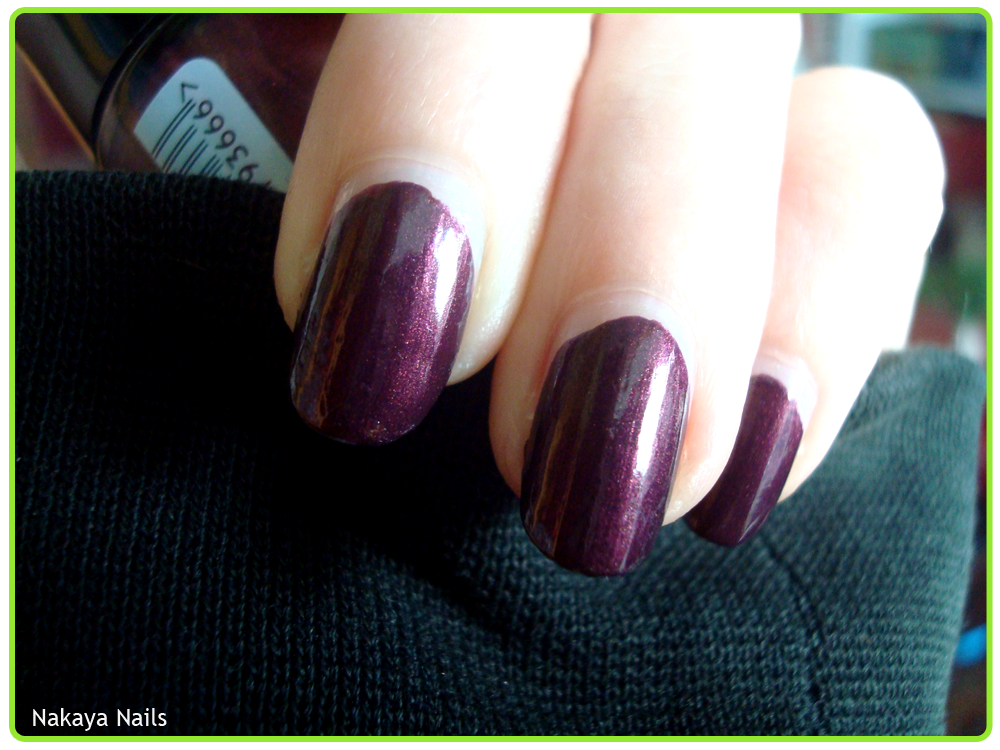
Catrice's '59 First Class Up-Grape' is a recent addition to my collection and the colour is an absolute stunner. The brush is an absolute nightmare, however. A fine formula as we've come to expect, and it covered in two coats. The brush is really the only downside, it's poorly shaped and the bristles that stick out there damage your polish more than it applies it, so it takes a little doing.
 But the colour - the colour! My pictures are nowhere near to doing it justice. It's a gorgeous dark aubergine shade with a shimmer that's just right. If it wasn't for the brush, I'd have nothing but praise.

Monday, 29 September 2014

Creature of Habit.

I'm a creature of habit, because I fall back easily to comfortable nail art styles and colours. It feels like a bit of a cop out when I see others do magnificently varied things.. but this works for me. I just really love me some gradients, okay?

Anyway - I got a few rolls of striping tape off eBay not too long ago and was itching to try it out. It took a little patience to position the tape exactly the way I wanted it finger after finger, but I think the result is pretty much as I envisioned it.

White is Safari's 'No 56', lighter purple is Catrice '120 Plum Play with Me', and the darker is the older Catrice by the name of 'C03 Deep Purple'.


Thursday, 3 July 2014

Got The Blues.

 
 Catrice '55 Get The Blues'.

Feeling rather like a declawed kitten with my nails so short, here is the first of my recently acquired polishes. Because sometimes I'm a clever girl and I read up on the things I put on my nails prior to applying them, I read this one was fairly sheer and it would help to layer it over black. I applied a thin coat of Catrice's '39 Black to the Routes' and Blues layered over it beautifully. I chose to do two thinner coats, but I think one thicker one would've done the trick just as well.

Depending on the light it shifts between blue/greens and purple/blues - my kinds of colours. I read things about Catrice changing their collection again in the not so distant future, so if this colour appeals to you don't wait too long!

Sunday, 1 June 2014

You Belong to Rambo No. 5

And with this - another version of my beloved half rhombus - I complete the Catrice section of my Stash page. Post title is a mash-up of the two polishes used. The green is Catrice's '670 It's Rambo No. 5' and the mint blue is an Essence colour & go by the creepy name of '53 You Belong to Me'. No, nail polish, as a matter of fact, you belong to me. The 'colour & go' polishes were such a hit and miss in terms of quality that I almost never bought them for myself, but since they were very affordable I was often given them as little presents. This one falls under 'miss', which is a shame because I like the shade, but its coverage is terrible and the formula is very disappointing, very streaky. It is however fine for this type of thing.
Added a little rhinestone because I don't often do, and made the rest matte because I think it's suits the army green of Rambo.

>> Click for tutorial <<

Friday, 30 May 2014

Blurple.

Continuing with the effort to have my Stash completely full, two more old Catrice polishes. Today I've got '120 Plum Play With Me' & '260 Blue's Brother'. I got these in a time where my collection was still starting to develop, so they're pretty much my kind of 'basic'.

120 Plum Play With Me
These older Catrices have a much stronger chemical smell about them than they do nowadays. Let's cherish what we have now.
I used two coats, which, as you can see, didn't cover all that evenly. I don't intend to wear these colours for long, so I let it be.
Artificial light, flash.
260 Blue's Brother
This picture sadly didn't turn out too hot, but by the time I noticed, it was too late and I had altered the polish already.
Unlike the purple, this sparkly blue covered fine in two coats, which is a plus.
Flash, artificial light.
I.. wish I had more to say about them, but it's pretty straightforward. I guess my final thoughts are that they are decent for what they are, but I'm grateful for the changes Catrice has made over time (brush size, chemical smell etc.)

To give some semblance of unity when wearing two different colours (on top of which one being sparkly and one opaque) I threw a matte top coat over them (NYC - 274 Matte Me Crazy).

Monday, 26 May 2014

We've got fun 'n games.


One of my goals is to have every polish on my Stash page linked. Which means I'll have to use them all.

Filling out all the Catrice polishes then seems like an attainable sub-goal, because I've got most of those up already!

Here 'C02 Welcome to the Jungle', from the Papagena LE in 2011. I've worn it, just not posted about it.

I should hope the post title reference is an obvious one.


I think that bottle cap has been strangely sticky and crackly since I got it. What's up with that?
Anyway.
Aside from whatever mysterious affliction the bottle has, I have basically no complaints about this polish. The colour is an interesting one. Sort of like an aged gold, if you see what I mean? It went on just fine in two coats and held up for a few days before any damage started to appear.
Whilst most shades can greatly vary depending on the lighting, this one seems to be continuously cut from  the same cloth.

Artificial light, flash.


Thursday, 8 May 2014

Berry Potter & Plumbledore.


Like I mentioned in the post before this one, one of my most recent acquisitions Catrice's '46 Berry Potter & Plumbledore'. Because I can't resist a pun, much less a Potter-pun. Previously I used it as part of a nail art, but of course I wanted to wear it on its own too. I've also shortened my nails a little since.
Application was slightly iffy because the brush seems to have a bit of a manufacturing error but nothing too catastrophic. I went for three coats for satisfactory opaqueness.

I think it's a great colour and I really love the heavy turquoise shimmer.


Artificial light - flash.

Wednesday, 23 April 2014

Long Time No Stamp.


I'm starved for title inspiration, is it obvious?

Recently added another Catrice polish to my collection, which stood out to me both for it's silly, pun-riddled name '46 Berry Potter & Plumbledore', and its interesting turquoise shimmer.

First I sponged it over '200 From Dusk to Dawn', but the difference in purples wasn't as big as I thought it would be, resulting in mostly a shimmery tip.


Using YSL '141 - White Gold', I wanted to add some details.. but really, none of it turned out the way I had planned it in my head.

I had only meant to stamp one nail per hand, but because the silver stripes didn't turn out as crisp as I wanted them (curse you, tape!) I stamped all my nails to try and cover it up a little.
I used a full-nail stamp from a BM21 plate, buuuut.. my nails are too long. I stubbornly tried it anyway and had to try and fill in the excess space with more stamping and it's all just a bit messy.
Despite it being a far cry from what I had originally wanted to do, I don't seem to dislike it, either.

Friday, 18 April 2014

Black & Blue.

Another half-rhombus. By now a cliché trademark choice.
I needed a new black since my older ones are getting droopy and no longer as easy to restore with a drop or two of nail polish thinner. Wanted to combine a light colour and that black in something easy.

Catrice, '39 Black to the Routes' & Rimmel, '198 Azure'.

Sunday, 16 March 2014

You win some, you lose some.

Left:  '90 - Dark Lavender'
Right:  '130 – Black Burgundy'

I have these two older Catrice polishes. A friend had borrowed one of them, and its return made me want to try it on again as well. Since I owned two of them, I wore them in succession.


Dark Lavender really positively surprised me. I've had these polishes for so long I don't know if I've ever worn them before let alone how the application was, and despite its age it had no problems whatsoever. It covered very well in two coats and dried fairly quickly. I also really like this shade of purple.
Flash  -  Artificial light.


Its redder cousin, Black Burgundy seems to have fared less well over the years. It had gone rather stringy and goopy, left bumps in the polish and started chipping pretty quickly. I'm hoping some nail polish thinner will return this to a state of usability, because it's a nice deep red colour I wouldn't mind using if the formula behaved.

Flash. (Artificial light photo unfortunately turned out very blurry, sorry!)

Tuesday, 24 September 2013

Marbled.


I've been meaning to try water marbling, it being one of those techniques that's so common but I'd never attempted it myself.
Estée Lauder - Blue Dahlia, Catrice - C05 Take It Mint

I then attempted it.
And sucked, terribly.
It was somewhat of a blow to the ego to find out there was a nail art technique I didn't just miraculously take to without all that much effort. It appeared I'd met my match. I did not quit, however, and gave it another shot.
This was my third try. I think it's okay. It is successful inasmuch that it has the marble effect on the nail.


It's not really my technique. Don't get me wrong, I think it can look absolutely amazing but when it comes down to it to me it's messy (which I hate), uncontrolled (which goes against my nature) and rather wasteful. One has to test a fair amount of polishes before you even find out what works with this, and then if you want to do more than two nails .. that's a hell of a lot of drops plopped in water, you know? To me, at least, the amount of nail polish expended is not worth the result. I may experiment with it again in the future, but probably not for more than accent nails like I did here. I can't imagine bothering with a whole hand, let alone two.