Showing posts with label Miss Sporty. Show all posts

Sunday, 12 March 2017

Thursday, 31 December 2015

Shimmery Send-off.

(If you don't know, these are 'oliebollen', a traditional Dutch new year's snack thing.)
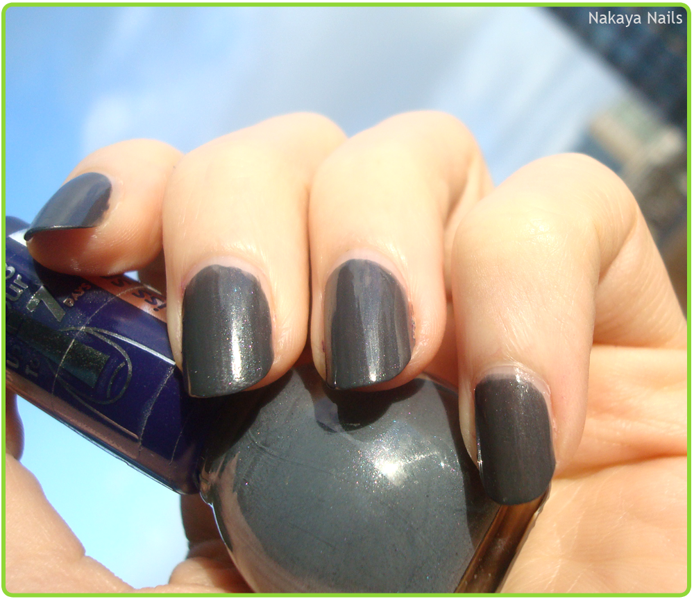
Here we are, arrived on the last day of the year, and the sun briefly came out to play to allow me to take pictures of what will be the last nail polish I wear in 2015. Thank you kindly, sun.
On that note, my blog-related new year's resolution is to write less about the darn weather. Will I be able to? We will see.

Anywho, I don't particularly enjoy New Year's Eve festivities but for the hell of it still chose a polish with a bit of sparkle to it, to end things on a fun note.

This Miss Sporty polish, only given the number '420' (insert 'blaze it' joke of choice here) is a nice cool grey, livened up with multicoloured shimmer.

Everyone have a wonderful 2016 ♥

Thursday, 10 September 2015

Accounting Jokes.


Every now and then you'll see a pattern or a colour combination somewhere that just clicks with the part of your brain responsible for nail polish creations. In my case, it happened whilst watching an episode of Parks and Recreation, where the character of Ben Wyatt was wearing this snazzy brown-blue striped tie. I've previously mentioned my fondness for the combination, so I'll spare you the repetition of the same and get down to it.

This nail art done with Essence's '03 My Boyfriend's Jeans' and Miss Sporty's '455'.

And just for those that don't watch Parks and Rec and went 'huh?' at this post title, the character Ben is an accountant and kept throwing in accounting puns over the course of the episode the tie was in.


Friday, 14 August 2015

Mer-miss.


nail art glitter
I had these little bottles of glitter sitting around on my desk and thought they'd make a nice mermaidish gradient, which is what inspired this mani.

It didn't really work out as planned.


Miss Sporty, '346',
Essence, '04 The Dawn is Broken'.


nail art glitter
The intended effect was lost in spacing them out too far and not having done multiple rows of each colour. I aim to repeat this mani in the future, because I think the idea - with better execution - would look lovely.

The main point of this post is to hold myself accountable to actually try this again, no matter how fiddly the process of glitter application is.

Thursday, 12 June 2014

Underrated.

Though I usually prefer to paint my own designs or get them through other techniques, I do enjoy the occasional stamping adventure. One of the things I really like in stamping is a pattern that covers a full nail. I don't get the chance to try that very often, because I generally like my nails to be longer than the plates will allow for. I trimmed my claws a fair bit the other day, so I hoped they would be short enough to allow this to work!
The plate is BM21, in case you struggle reading upside-down.


Not.. entirely a success.
I love the colour combination of blue and brown, and I think it's a vastly underrated one. It has been some time since I used it, so it was about time to give it another go in a different styling. Miss Sporty's '455' is my go-to brown and I was already previously aware that it carries a matte finish well, so that was an easy decision. I originally had a different blue in mind, but it looked very dark when stamped on so I switched that for a MAX (Action's own brand, I believe?) Nail Art Polish called 'Blue Galaxy'.

In real life the look is a lot more subtle as here I obviously tried to photograph it in its most visible state. As you can see the stamping didn't go all that well. Since I'm not too experienced a stamper, I struggle with placement and end up not getting part of the design on. Oops. I don't mind too much, though. It's not that apparent unless you're on top of my hands.

For my thumb, which is too broad and still too long to fit the full-nail design on, I went for a small detail. It came from one of Essence's stampy plates.
I had meant to center it more, but like I mentioned, my stamping-aim is not that great.

Friday, 6 December 2013

Complementary, my dear Watson #2.

After quite liking the result of the previous one, I thought I'd try another round of a complementary colour gradient.

Polishes used:
Herôme W.I.C, Utreg 173 (base yellow)
Hema, 76 Neon (yellow)
Hema, 74 Neon (purple)
Miss Sporty, Sparkle Touch (sparkles)


I'm not sure about the sparkles. On one hand, they're pretty distant from the gradient that's going on but on the other hand I sort of like the look of it. Perhaps unnecessarily festive but who cares.

That's blue-orange and yellow-purple done, leaving basically red-green which I won't go to soon. Perhaps for Christmas, but not yet. Not sure what I'll go for next, for now I quite like the look of these!

Saturday, 10 August 2013

330.

Natural light.
It's hard not to wear copious amounts of green for me, it really is. Anyway, this fresh minty green is a Miss Sporty Clubbing Colours polish bearing the number 330. It requires a good three coats to stop the nail shining through too much, sadly. On that basis alone I wouldn't really recommend it. Yet, it's quite a nice colour, so if you can spare the time for the extra coat it's lovely!

I could give it another positive spin by suggesting it could be something close to a budget 'Island Palm'.

Sadly the second day of wearing it this polish got seriously beat up. This is mainly due to working with my hands (folding boxes, filling boxes, carrying boxes..), but that does mean I can't give a very accurate statement on how long it holds up before it starts chipping under 'regular' circumstances.


Artificial light - flash.

Sunday, 4 August 2013

Double Swatch.

Heya. Swatch time.
I'd describe this as a burgundy with purple undertones. It's a Miss Sporty polish bearing the number 340 and is apparently 'Long Lasting'. It started chipping on day two of wearing it but I guess 'long' is an undefined term.. I do really like the colour though it was hard to get it evenly over all the nails. I'm thinking another coat would have done it, though.
Flash - artificial light.
Somewhere down the line it appears I stopped doing these light comparisons, which is a shame, really. One picture in one kind of light is unlikely to really show the full scope of a colour so I intend to bring it back for my swatch posts. You can see the purple undertone in the artificial light quite well.

Bonus swatch that I still had lying around from June but would be silly now to devote its own post to:
This is one of the Rimmel polishes I was given for my birthday, '519 Desert Beauty'. I'm not sure how to describe this colour. It's not quite a gold. Too shiny to be described as really resembling sand which I think the polish name is aimed at. Like a lot of lighter tones it's hard to get longer nails covered opaquely, so it requires more coats for longer nails, less for shorter.

Sunday, 6 January 2013

Is this not what you expected to see?

If you wanna find out what's behind these cold eyes,
You'll just have to claw your way through this disguise

I really, really love The Wall. I'd been meaning to do this for a while but kept putting it off (dreading the effort I expected was involved in getting the bricks properly across both hands) but I did it now!
Not really as planned, and my right hand definitely came out looking less than stellar. If I can have a superpower, I want it to be ambidexterity.

Polishes used;
Koh 'Black!'
Miss Sporty Clubbin Colours '70'
Rimmel
'Nail Tip Whitener'
NYC '003 Prey of Grey'
Bodique (Hunkemöller) 'Rood (red)'

Thursday, 22 November 2012

Sparkle Touch.


Etos had a two-for-one going.. so, how could I resist, right?
The mother of pearl colour on the right originally caught my eye, and then I figured I'd get a sparkly effect polish because I rarely use those and it might be fun!


Curse of the in-door pictures, I'm tellin' ya.
Sparkle! It's like a party on your nails.
The mother of pearl colour was really sheer, and I really should've layered it with something more opaque. 20/20 hindsight, I guess.

Miss Sporty 040 and 'Sparkle Touch'.

Sunday, 12 August 2012

I'm Blue...

...Da ba dee.. sorry. I'm a child of the 90's. This Eiffel 65 song is so deeply ingrained into my subconscious I am never, ever going to be able to rid myself of it. I've tried avoiding it as a title until now, but what the hey.
Here we have a layering experiment that looks like a lighter shade, budget version of Midnight Blue. If you think that's somehow a good thing, I would actually recommend just handing out the money for Midnight Blue.
This 2True polish was an untried, and I have a few polishes from this budget brand that I'm really very pleased with, but this isn't one of them. It would have taken a gajillion layers to get even the slightest hint of opaqueness, so I grabbed the Miss Sporty polish to give it a foundation to build on. It's not that clear in the pictures, but you can still see a lot of nail shining through. Ah well, can't win 'em all.
So shiny, though!

Monday, 16 July 2012

Paint to Match.

I'm generally not the type of person that bothers matching their nails to their wardrobe or vice versa, but I bought this pair of trousers recently and thought it'd also make a nice set of nails. Blue stripes of varying width and spacing with a warm brown underneath.. and of course, matte. And, y'know, the least neat nail 'art' I've done in a while. Does it absolve me somewhat if I say I was in a hurry :P?
Brown is Miss Sporty 455, matte is NYC Matte Me Crazy as per usual.
Took this picture after I'd been wearing it for a while and it shows.. the shaaaame!

Wednesday, 18 April 2012

Identity Crisis.

This, is a beautiful colour. Before I put it on I remembered it as being a lot more green than it actually was, and in the (lack of) light in my bedroom it also seemed.. less blue. But once outside - blam! It suddenly struck me as being, rather than green, so very teal.
Doesn't it look like it could've been the kid of these two polishes?


There is a fair amount of shimmer going on in this Miss Sporty (Clubbing Colours) polish.
It covered very nicely in two coats and there had been pretty much no sign of tip-wear when I took it off the week after, so that's always a plus.
Artificial light - flash.

Saturday, 31 March 2012

Clubbing blues.

I feel like I've been grossly negligent in updating this blog lately. Another day and it would've been three weeks, woops. I have no excuses besides being lazy and spending all my time watching House. But I digress.

Bit of a blast from the not-so-distant past; these pictures hail from before I chopped my babies down. A blue I will describe as 'vaguely cobalt-esque but not entirely so', and is one of Miss Sporty's Clubbing Colours. In real life it had an interesting vibrancy that was difficult to capture on camera. Nothing too extraordinary, but still a very nice colour in a budget polish.
Also - another untried down.. quite a few more to go!

Saturday, 10 March 2012

Omelette du fromage.

If that title made sense to you, odds are you're gonna like this post.
Or.. that you enjoy French and eggs.. but I digress - onto the nails!


This post sadly brings with it my significantly shorter nails. Ouch. I broke my middle finger nail making a Sally dress for my little sister, and chopped the rest down as well. It's also been really long since I did some proper nail art (roughly three months or so?) so I'm glad I did.
Anywho, a group on deviantART I'm a member of has Cartoon Network as its monthly theme, and I spent three years of my life doing very little else besides watching Cartoon Network!
I was instantly inspired to go for the cartoon I've cherished very much since I first saw it, Dexter's Lab. It's been a favourite for years and I frequently still watch the episodes. But I'm sure you don't care about my television-related life story and I'll just show you more pictures.

  The blue behind Dexter is a Miss Sporty polish. I wore it before my nail broke and I took some pictures so I won't get into it yet.
The darker blue on my empty nails is My Boyfriend's Jeans by Essence, from their Denim Wanted! collection some time ago.
The pink behind DeeDee is a L'Oreal Resist & Shine Titanium polish and has been previously discussed in A Study in Pink.
The characters themselves have been painted with gouache and acrylic paints and a 00 brush.


Friday, 17 February 2012

I'm in love.


No, this isn't a belated Valentine's Day post. No, I'm not actually in love. Not with a person, anyway. When I ordered Watermelon Rind, I also ordered my first flakies (Golden Rose -  12). I had been wanting to get some for quite some time but never actually made an effort to get them, y'know what I mean? This was before I considered buying nail polish online. Well, that day I made the effort anyway. And I couldn't be happier.
How incredibly stunning they are! I spent a considerable amount of time getting distracted by the pretty shinies on my fingertips, I must admit.
Flash - Artificial light
 The polish underneath is one of my (now previously) untried, and it's a nice chocolatey (depending on the light) brown by Miss Sporty, from their 'Lasting Colour' collection. Not a very special colour, but the application is fine, the coverage is a little sheer but it's a budget polish so I shan't complain.
The effect of the flakies is sadly a bit lost indoors or when there's a lack of sun. Which sadly is mostly, nowadays. But I will love their goldish-orangish-greenish shine all the same in whichever light I find myself in.

Thursday, 26 January 2012

Hues of Blues.

Another non-current picture.
The blue consist of various layers; it was intended to be 'Bogota' bij Herôme's W.I.C. collection, but I found it to be so sheer I had to layer it. Underneath is an almost pastel cyan blue polish by Manhattan with Bogota on top, and I believe I tried a light blue polish from Essence in there somewhere.

The blue crackle is Miss Sporty, which crackled into much smaller pieces than I'd have liked. My other experience with crackle polishes lies with OPI's black shatter, which when applied with a relatively thick coat, crackles into nice big chunks, as I'm sure you know. I couldn't seem to replicate that kind of crackle with this blue.
But of course, this is a budget polish, and for the money I paid (€1.99 - no money at all) I can't say I'm disappointed. It's a nice shade of blue with an application I otherwise find acceptable. Having said that, Miss Sporty's black crackle crackles (what an overuse of the word!) just fine.

Friday, 20 January 2012

Starry Night.


Older nail art again. Done in April 2011, for a school assignment! Getting points for polishing nails, isn't that just living the dream? I study Art & Design, and at some point we were given the assignment to recreate a famous painting/work of art (that wasn't the Mona Lisa) in an 'unusual medium'. I chose to do van Gogh's 'Starry Night' in my favourite material.  The teacher seemed to quite like it, and she'd never had someone do nail art for her class.

Polishes used; see labels
If anybody is interested, I still have pictures of how I did this pretty much step by step.