It is my goal to stubbornly keep attempting the occasional water marble nail art until one day I might actually be able to pull them off with only a minimum of frustration! Still going for the darker, autumny colours, though my fellow nail bloggers make me feel like I should be on the Christmas train at this point.
Colours used are Dior, '605 Amazonia' and Catrice '670 It's Rambo No. 5'. The latter of which I've since given to my sister because in the many years I've owned it it has been used.. maybe twice.
Showing posts with label Dior. Show all posts
Sunday, 20 December 2015
Monday, 23 November 2015
Autumn.
Of all the seasons, autumn is the one with the best PR. With pictures of leaves in beautiful colours, cozy sweaters and pumpkin spice lattes, it's enough to make you actually look forward to it.
And then it arrives.. and it's rain, wind and cold all day, every day. No thank you!
That said, I still felt like doing some nails suited to the season. In retrospect, I think I should have used either a darker brown or a lighter shade of red to have it look best, but I'm still satisfied with the result the way it was.
Polishes used are the following -
Dior, '413 Grège'
Dior, '943 Rouge Garconne'
Chanel, '697 Terrana'
Herome WIC, 'Utreg 173'
Herome WIC, 'Zagora 150'
P.S., white.
And then it arrives.. and it's rain, wind and cold all day, every day. No thank you!
That said, I still felt like doing some nails suited to the season. In retrospect, I think I should have used either a darker brown or a lighter shade of red to have it look best, but I'm still satisfied with the result the way it was.
Polishes used are the following -
Dior, '413 Grège'
Dior, '943 Rouge Garconne'
Chanel, '697 Terrana'
Herome WIC, 'Utreg 173'
Herome WIC, 'Zagora 150'
P.S., white.
Labels:
413 Grège,
697 Terrana,
943 Rouge Garconne,
Chanel,
Dior,
Herôme,
nail art,
nails,
P.S.,
Utreg 173,
W.I.C.,
Zagora 150
Saturday, 2 May 2015
Deco.
In a previous post, I mentioned that I had become inspired by some art deco patterns I'd seen, and added a picture of a failed attempt at doing some nail art along those (proverbial but I guess also literal) lines.
Though the execution didn't quite go as intended at the time, the inspiration itself still tugged at me and I was up for trying something else. Gold on its own isn't really my thing, but use it sparingly and as an effect colour next to black and I'm happy to wear it.
Art deco is of course marked by its symmetry and its geometry, and it is easy to miss the mark when you utilise a technique like water marbling which doesn't always grant you that much control, but I think I did alright in retaining the general vibe of the style here.
Polish used are Dior's '668 City of Gold' and Catrice's '39 Black to the Routes'.
Though the execution didn't quite go as intended at the time, the inspiration itself still tugged at me and I was up for trying something else. Gold on its own isn't really my thing, but use it sparingly and as an effect colour next to black and I'm happy to wear it.
Art deco is of course marked by its symmetry and its geometry, and it is easy to miss the mark when you utilise a technique like water marbling which doesn't always grant you that much control, but I think I did alright in retaining the general vibe of the style here.
Polish used are Dior's '668 City of Gold' and Catrice's '39 Black to the Routes'.
Saturday, 27 October 2012
All that glitters is not gold.
Oh my god, I haven't updated in nearly a month!
It's been a case of boring manicures which often chipped before I got around to photographing them, or me being too busy to post or even do my nails (which are sadly the first to suffer when I have things to do).
So, without further ado, here's some admittedly boring pictures of Dior's '668 City of Gold', taken inside because there was no sun to be found at the time.
It's been a case of boring manicures which often chipped before I got around to photographing them, or me being too busy to post or even do my nails (which are sadly the first to suffer when I have things to do).
So, without further ado, here's some admittedly boring pictures of Dior's '668 City of Gold', taken inside because there was no sun to be found at the time.
Sunday, 19 August 2012
Another one of those.
This is my 50th post! Woohoo!
I say 'Another one of those' because this is another what I refer to as a half rhombus mani (also called a v-gap and several other things but I think half rhombus sounds about 20% cooler.). I really love them. This is the fourth I've done, I think. On we go!
It's Dior '903 - Black Ink', which is a dark blue that in most light - as implied - looks basically black.
Not the world's neatest mani, but I'm content with it. Only one layer of Black Ink over a lighter polish, so it doesn't look totally black. After years of wearing mostly black nail polish, I now rarely do.
Would you look at that stunning blue shimmer? It looks MARVELOUS out in the sun, it really does.
Deep, dark polishes really look their best in the brightest sun, don't you think? A little ironic perhaps, but I'll roll with it.
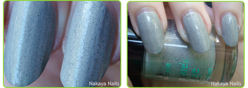
The polish underneath, however, I'm not so happy about. It's '04 - The Dawn is Broken' from Essence's Vampire's Love LE. I had an unfair prejudice against this polish to begin with because I don't care for Twilight in the slightest, and the dislike turned somewhat justified when it turned out I don't like this polish. At all.
Yuck. It looks gritty and it reminds me of cement. I sort of like the general idea of the polish, but it just doesn't look right. Largely hidden under the Dior polish I don't mind it so much, though. Still think I won't be using it again any time soon.
I say 'Another one of those' because this is another what I refer to as a half rhombus mani (also called a v-gap and several other things but I think half rhombus sounds about 20% cooler.). I really love them. This is the fourth I've done, I think. On we go!
It's Dior '903 - Black Ink', which is a dark blue that in most light - as implied - looks basically black.
Not the world's neatest mani, but I'm content with it. Only one layer of Black Ink over a lighter polish, so it doesn't look totally black. After years of wearing mostly black nail polish, I now rarely do.
Would you look at that stunning blue shimmer? It looks MARVELOUS out in the sun, it really does.
Deep, dark polishes really look their best in the brightest sun, don't you think? A little ironic perhaps, but I'll roll with it.
The polish underneath, however, I'm not so happy about. It's '04 - The Dawn is Broken' from Essence's Vampire's Love LE. I had an unfair prejudice against this polish to begin with because I don't care for Twilight in the slightest, and the dislike turned somewhat justified when it turned out I don't like this polish. At all.
Yuck. It looks gritty and it reminds me of cement. I sort of like the general idea of the polish, but it just doesn't look right. Largely hidden under the Dior polish I don't mind it so much, though. Still think I won't be using it again any time soon.
Subscribe to:
Posts (Atom)